Tino's Branding
Overview
Serving flavour through visual expression.
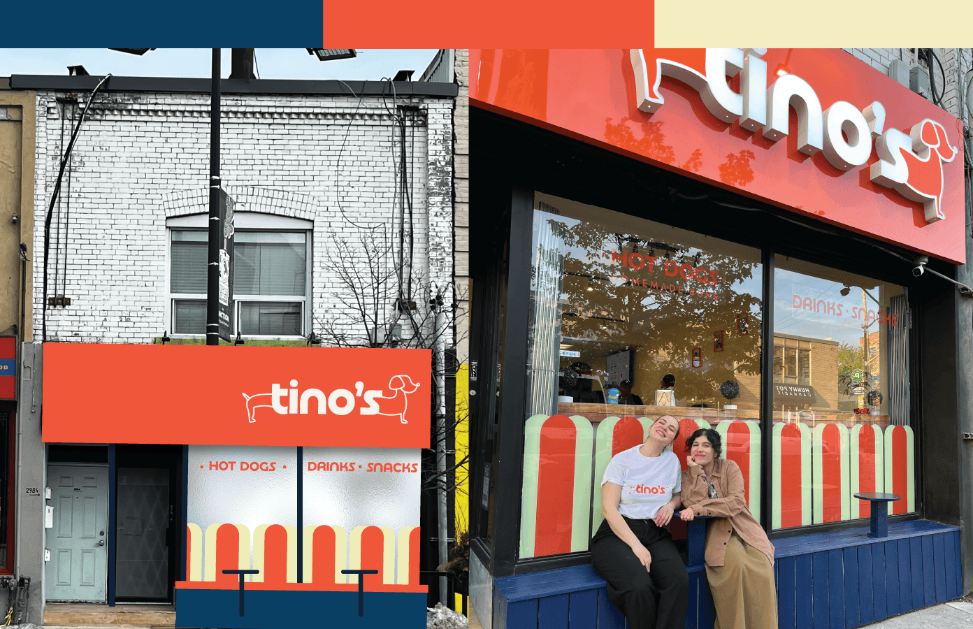
I designed a brand identity for a gastronomy client in Toronto, Ontario, blending culinary passion with visual personality. My role encompassed brand concept, visual development, and stakeholder collaboration, resulting in branding that invited connection and appetite, and was embraced across cultural contexts, which is a stamp of the hot dog's brand.
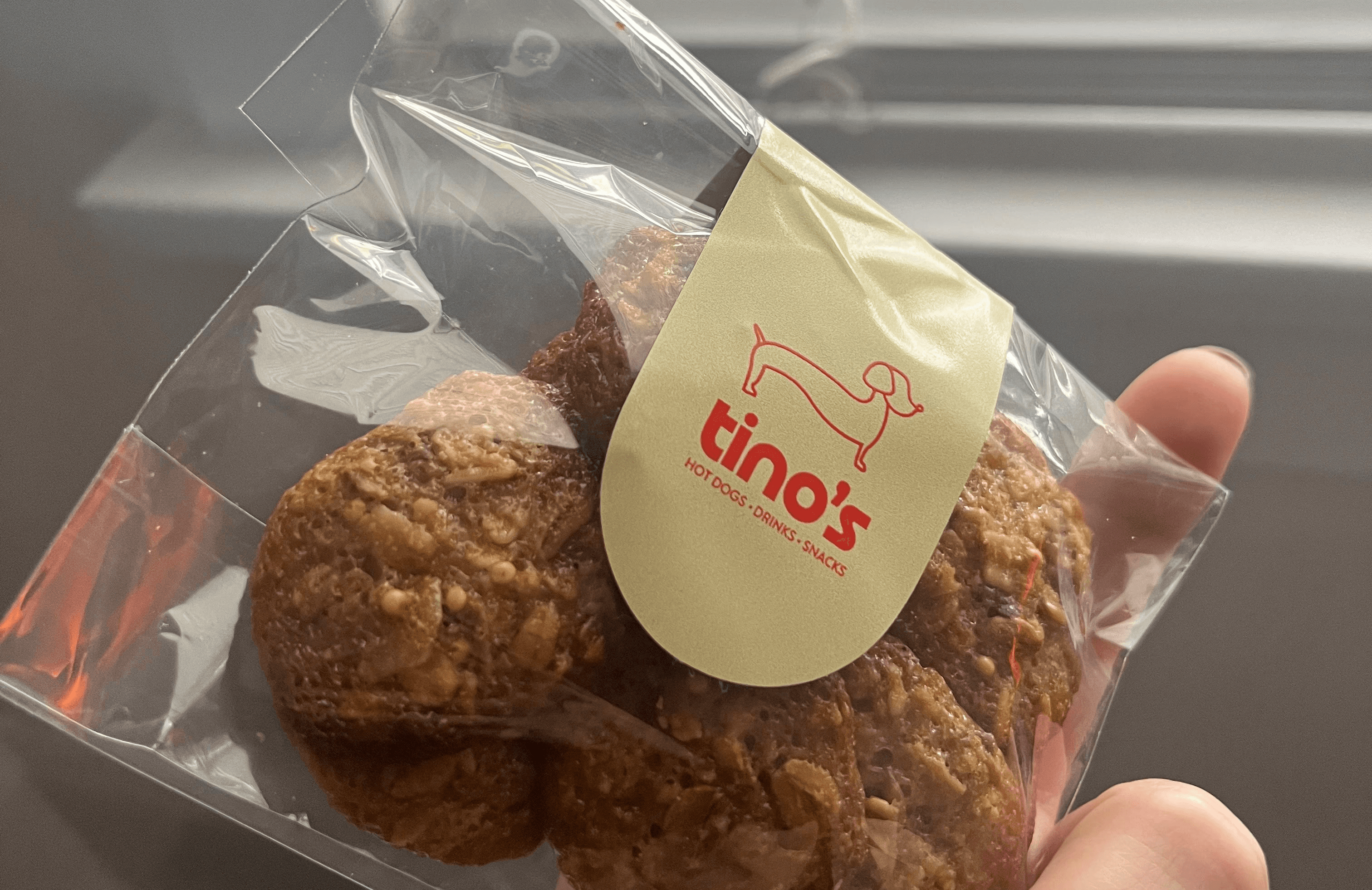
The restaurant owners wanted the brand to be recognizable, fun, and family-friendly. This approach involved applying a vibrant colour palette and incorporating easy, simple, yet noticeable elements to help the clients remember and keep in mind.
This brand is alive and continues growing on Dundas St.
Categories
Branding
Gastronomy
Date
Client
Tino's
Preview
Click here


Tino's Branding
Overview
Serving flavour through visual expression.
I designed a brand identity for a gastronomy client in Toronto, Ontario, blending culinary passion with visual personality. My role encompassed brand concept, visual development, and stakeholder collaboration, resulting in branding that invited connection and appetite, and was embraced across cultural contexts, which is a stamp of the hot dog's brand.
The restaurant owners wanted the brand to be recognizable, fun, and family-friendly. This approach involved applying a vibrant colour palette and incorporating easy, simple, yet noticeable elements to help the clients remember and keep in mind.
This brand is alive and continues growing on Dundas St.
Categories
Branding
Gastronomy
Date
Client
Tino's
Preview
Click here
Tino's Branding
Overview
Serving flavour through visual expression.
I designed a brand identity for a gastronomy client in Toronto, Ontario, blending culinary passion with visual personality. My role encompassed brand concept, visual development, and stakeholder collaboration, resulting in branding that invited connection and appetite, and was embraced across cultural contexts, which is a stamp of the hot dog's brand.
The restaurant owners wanted the brand to be recognizable, fun, and family-friendly. This approach involved applying a vibrant colour palette and incorporating easy, simple, yet noticeable elements to help the clients remember and keep in mind.
This brand is alive and continues growing on Dundas St.
Categories
Branding
Gastronomy
Date
Client
Tino's
Preview
Click here